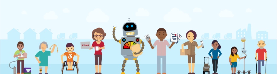
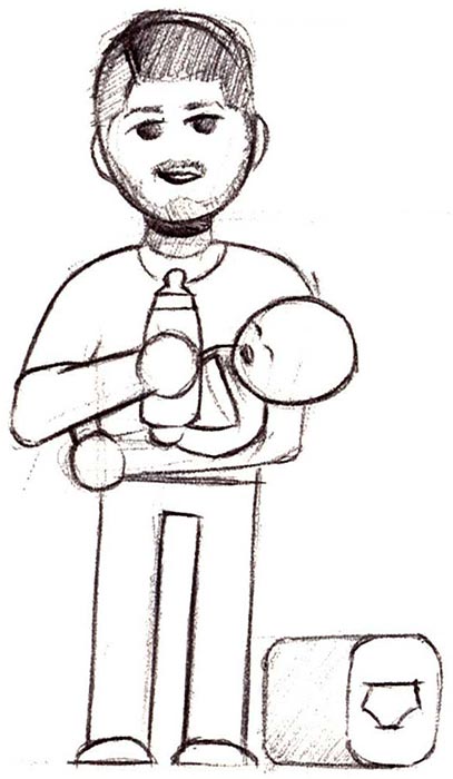
Visual Style Development
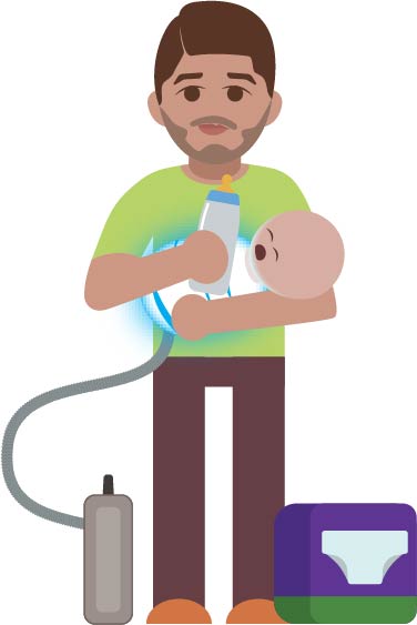
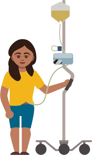
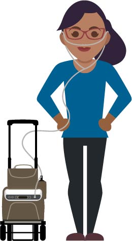
Our site needed a focused visual style. Deciding that using images of actual patients was problematic, and that the normal clip art usually employed by other HME companies would feel disingenuous, I settled on meeples to represent patients and the people who work at HME companies.
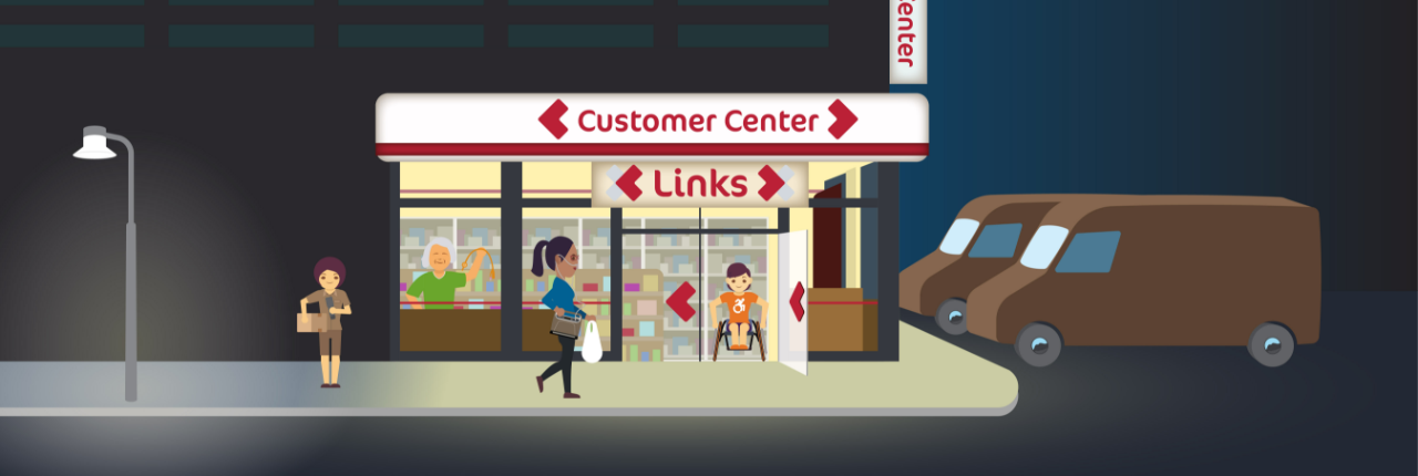
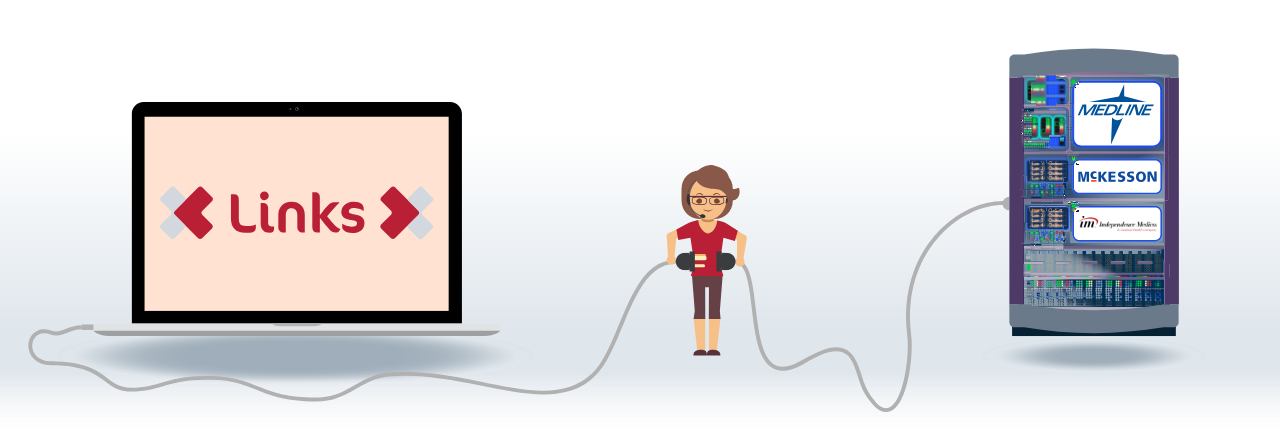
Illustrations for Features Page
Taking the characters created for the banner page, I was able to fully realize our voice through the visual design of our website by creating illustrations for our features pages.
Customer Center Portal
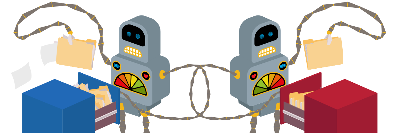
Integration with Vendor Catalogs
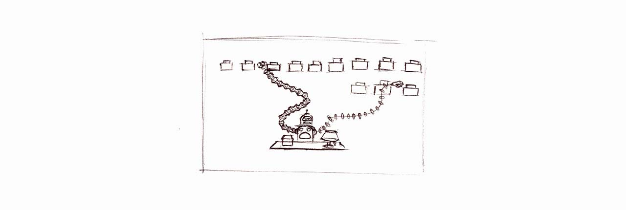
Fulfillment Service Integration

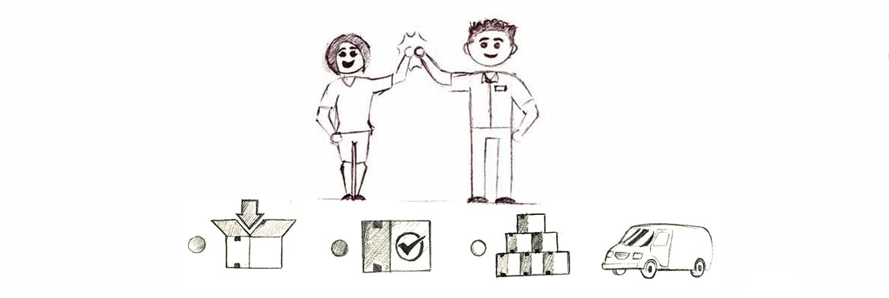
Conversion
Cloud Connectivity
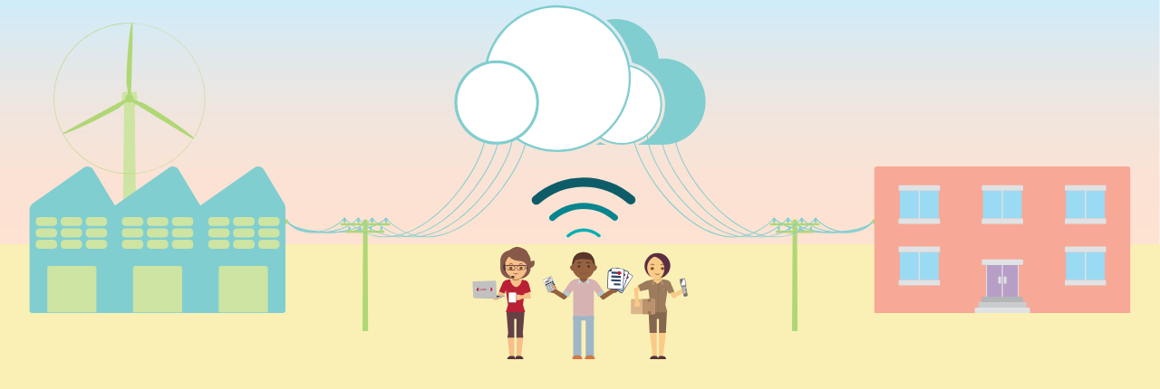

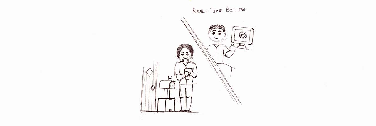
Real Time Billing

Retesting Style
Now that I had created a rough design of our homepage, I knew I needed to test it. The cartoon characters were a bit of a jump, so I gave potential users a page of adjectives and showed them the homepage for 5 seconds to get their immediate initial impression. I had them select up to 5 adjectives that they felt described the website. I then had them to browse the site without a time limit and circle as many words as they liked. Tallying each word gave me a quantitative analysis of how my website felt. To get a qualitative understanding, I also asked them several questions as well. The results are as follows:
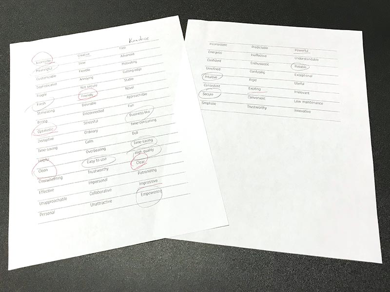
Top Adjective Results
- Friendly
- Easy To Use
- Useful
- Clear
- Convenient
- Creative
- Clean
- 8
- 13
- 5
- 6
- 5
- 5
- 6
What Did the Users Think?
- Likes avatars-good for marketing down the road
- Hard to tell it's a DME
- It feels easier to use if it’s cute
- I didn’t immediately think HME software (but when I think of HME software I think of Medact)
- Images are a little spartan
- I personally like the picture, not sure if someone will take it seriously
- "I'm not a real serious person"
- Feels clean and not lots of content on the screen
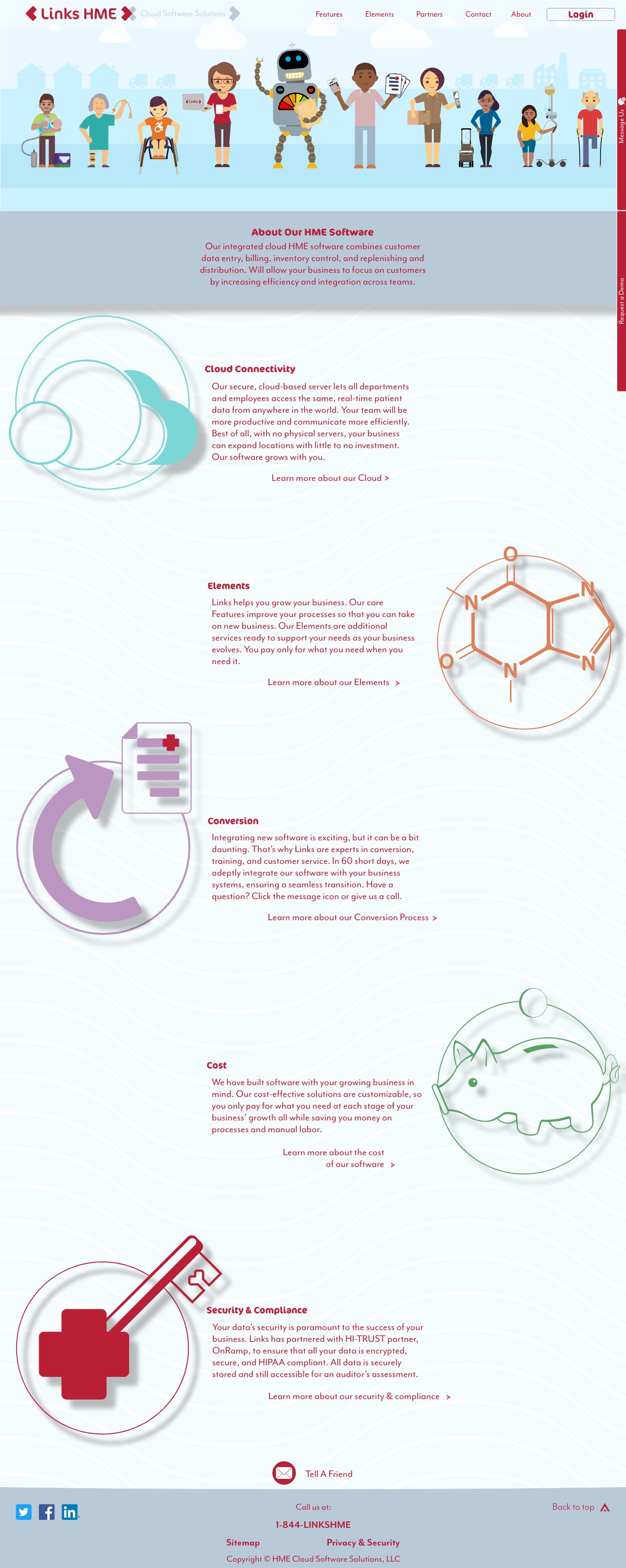
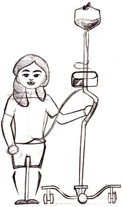
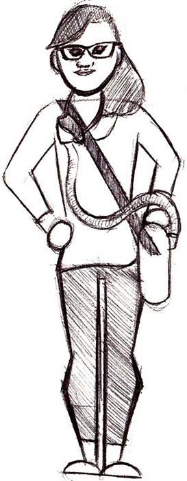
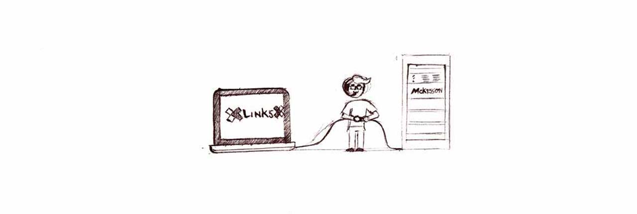
Homepage First Draft
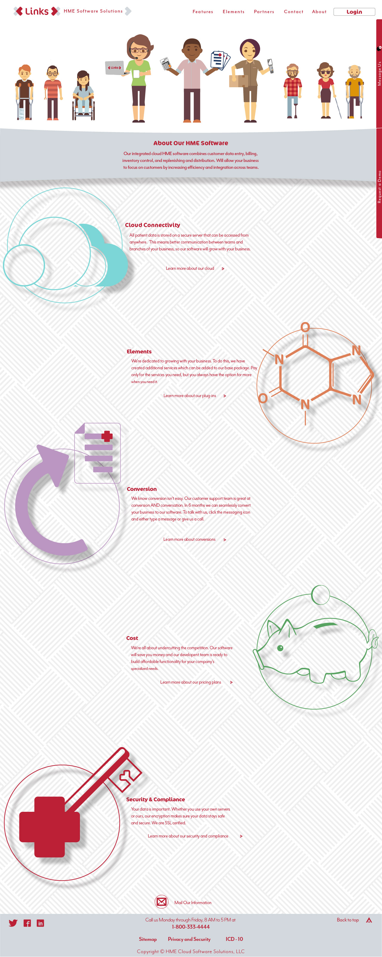
Final Homepage